More than light and shadow: the subtle details of Rembrandt's mastery
High-tech analysis reveals sophisticated use of pigments
15 September 2025
The study was part of the research of PhD candidate Nouchka De Keyser. She recently obtained her doctorate under the supervision of Prof. Katrien Keune, head of research at the Rijksmuseum and professor at the UvA's Van 't Hoff Institute for Molecular Sciences. The work was also part of the major scientific study of Rembrandt's masterpiece Operation Night Watch and involved cooperation with several other universities and institutions.
Playing with light, shadow and context
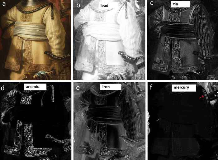
The paper in NPJ Heritage Science describes how high-tech macroscopic imaging techniques helped to gain insight into Rembrandt's painting process in Van Ruytenburch's embroidered costume. Identification of the chemical compounds present and their microscopic structure revealed how Rembrandt applied a refined palette of pigments. These include lead white, lead-tin yellow, yellow and red ochres, vermilion, arsenic sulphide pigments, red lacquers, smalt and azurite.
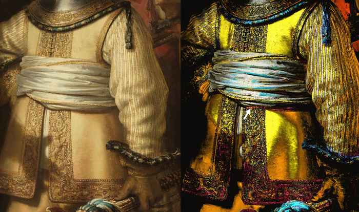
The research shows that Rembrandt used all these pigments in a consistent, systematic way to achieve pictorial unity. Experts use this term to indicate that the elements in a painting form a natural, harmonious ensemble, where everything feels “right”. Lighting is a crucial aspect in this regard. In order to convincingly render gradations of light and shadow, Rembrandt applied the pigments in groups to achieve tonal contrasts between the illuminated and shaded areas.
In this way, he created an optical phenomenon that is now known as the simultaneous contrast effect. It is a way of achieving colour variations without mixing different types of paint or tonal values. Rembrandt always used the same pigment (such as yellow ochre), but placed it strategically in light and dark areas. This makes the colour appear lighter or darker, depending on the surrounding tones and contrasts.
Historical confirmation
The researchers' observation corresponds with a note about Rembrandt's painting technique by his pupil Samuel Van Hoogstraten. In the fifth chapter of his treatise Inleyding tot de hooge schoole der schilderkonst: anders de zichtbaere werelt (Introduction to the High School of Painting: or the Visible World), Van Hoogstraten writes that Rembrandt was a master at combining complementary colours.
He advises artists to follow Rembrandt's example: do not allow light and dark to blend too much, but group them in a clever way: ‘let your strongest lights be accompanied by lesser lights, I assure you that they will shine all the more beautifully; let your deepest darks be surrounded by clear browns, so that they may contrast all the more powerfully with the strength of the light.’
This interplay of light, shadow and context gave Rembrandt's paintings a natural depth, volume and three-dimensionality. Although the concept was only named later, scientists such as Ibn al-Haytham and Leonardo da Vinci were already familiar with the principle that colours and brightness are perceived differently depending on their surroundings. Rembrandt consciously applied this to create a convincing chiaroscuro (light-dark) effect.
Degradation research
Advanced research techniques also made it possible to identify ageing processes in The Night Watch. The presence and distribution of lead arsenates (mimetite Pb5(AsO4)3Cl and schultenite Pb(HAsO4)), calcium oxalates (weddelite, CaC2O4·2H2O) and a potassium-containing lead sulphate (palmierite K2Pb(SO4)2) were established. These compounds were formed over time by the degradation of the pigments originally used. This enabled the researchers to map the influence of the degradation products on the representation of Van Ruytenburch's costume and Rembrandt's light-dark contrasts better than ever before.
Paper details
Nouchka De Keyser, Annelies van Loon, Francesca Gabrieli, Frederik Vanmeert, Fréderique T. H. Broers, Petria Noble, Steven De Meyer, Arthur Gestels, Victor Gonzalez, Mitra Almasian, Inez van der Werf, Erma Hermens, Koen Janssens & Katrien Keune: Illuminating Rembrandt’s Chiaroscuro in The Night Watch: the painting process of Van Ruytenburch’s costume. npj Heritage Science volume 13, Article number: 406 (2025). DOI: 10.1038/s40494-025-01874-w
See also